
This is the second part of the React Table Tutorial, where I'll show how to give the table a modern styling with Tailwind CSS. If you haven't already, check out the first part of this tutorial, where I cover implementing the functionality like search, filter, sorting and pagination with React Table.
You can find the code for this tutorial on GitHub.
What is Tailwind CSS?
When it comes to styling websites and web applications, a CSS framework that has gained a lot of traction over the last two years is Tailwind CSS. Tailwind CSS is a utility-first CSS framework, that allows to build modern websites without ever leaving the HTML markup.
Check out their website for a few examples showing how easy it is to create beautiful, modern and responsive (i.e. the design adapts to different screen sizes, like desktop, tablet or phone) websites.
In the last two years, Tailwind CSS has been the CSS framework with the highest developer satisfaction and it's made a massive jump in usage from 6% in 2019 to 26% in 2020, a staggering 20% increase in just a year (see State of CSS survey).
Personally, I like Tailwind CSS because it makes developing web sites and applications so much easier for me. If you've worked with Bootstrap, a CSS framework that is still quite popular, you might be familiar with the issue that once you step away slightly from the pre-defined design, you have to start writing your own CSS and that quickly becomes really messy. Tailwind CSS, for me, hits a sweet spot of abstraction, as the utility classes provide almost like a design system, that helps to create visually consistent UIs by constraining me to a range of sensible options. At the same time Tailwind CSS provides (almost) all the flexibility of modern CSS. Just recently the flexibility got a big boost, as the new JIT (just-in-time) compiler allows using arbitrary values in-line.
Another great benefit in my opinion is developer on-boarding. When joining a new project, one doesn't have to spend weeks to try to understand how the CSS classes have been laid out, before you're brave enough to modify it. It's all right there in the markup of the component you're working on - easy and understandable.
A common critique of Tailwind CSS is that it doesn't follow the separation of concerns principle for markup and styling. However, if you have ever worked with HTML and CSS, you'll realize that this separation of concerns isn't really possible, as the CSS selectors always have to follow the markup structure. As a result, you're actually repeating code - and thus violate the DRY principle (don't repeat yourself). Also, this approach frees you from having re-invent sensible class names constantly. Read more about this topic in this article by the creator of Tailwind CSS, Adam Wathan.
Another misconception is that Tailwind CSS is just another form of inline styles. Inline styles are frowned upon for good reasons, as they can't handle pseudo-classes like hover and focus styles, they don't handle deeper nesting like selector lists or CSS combinators, and they don't have access to media queries for responsive design, just to name a few. All these things, Tailwind CSS handles with flying colors. Check out this article by Sarah Dayan for an in-depth comparison.
Tailwind CSS has a brilliant documentation and great resources to learn. Check out this playlist on Adam Wathan's Youtube channel, to learn how to use Tailwind CSS. There are also plenty of websites that offer designs (often for free) build with Tailwind CSS, e.g. Tailwind UI, Tailwind Components and MerakiUI. Just find what you need, copy-paste and modify to your needs. Voilà!
That being said, let's start and integrate Tailwind CSS into our React project.
Setup
To set up Tailwind CSS in a Create React App project, follow the instructions from the documentation. It's a few steps, but it should work seamlessly.
When you're done with the setup, run npm start. Our application with the table should now look like this.

What happened? Well, by default, Tailwind CSS applies a base design to all elements of your website, so everything can be solely controlled by the utility classes. This is great, because it allows you to separate the semantic structure of the HTML from the design.
To make working with Tailwind CSS easier, and if you're working with VS Code, I recommend to install the Tailwind CSS IntelliSense, so you get auto-completion for the Tailwind classnames.
Style the app
Let's start making this look a bit better.
Update the App component in src/App.js as follows.
// src/App.js
...

function App() {
  ...

  return (
    <div className="min-h-screen bg-gray-100 text-gray-900">
      <main className="max-w-4xl mx-auto px-4 sm:px-6 lg:px-8 pt-4">
        <div className="">
          <h1 className="text-xl font-semibold">React Table + Tailwind CSS = ❤</h1>
        </div>
        <div className="mt-4">
          <Table columns={columns} data={data} />
        </div>
      </main>
    </div>
  );
}
We're giving the background a light gray and set the default text color to a dark gray, which is a technique often used in modern UI design. Then we're giving the main container a max width, center it and also apply some padding.
Style the table
Let's head over to Table.js. We'll copy most of the classes from the table component on TailwindUI.
function Table({ columns, data }) {
  ...

  return (
    <>
      {/* global search and filter */}
      {/* table */}
      <div className="mt-2 flex flex-col">
        <div className="-my-2 overflow-x-auto -mx-4 sm:-mx-6 lg:-mx-8">
          <div className="py-2 align-middle inline-block min-w-full sm:px-6 lg:px-8">
            <div className="shadow overflow-hidden border-b border-gray-200 sm:rounded-lg">
              <table {...getTableProps()} className="min-w-full divide-y divide-gray-200">
                <thead className="bg-gray-50">
                  {headerGroups.map(headerGroup => (
                    <tr {...headerGroup.getHeaderGroupProps()}>
                      {headerGroup.headers.map(column => (
                        // Add the sorting props to control sorting. For this example
                        // we can add them into the header props
                        <th
                          scope="col"
                          className="px-6 py-3 text-left text-xs font-medium text-gray-500 uppercase tracking-wider"
                          {...column.getHeaderProps(column.getSortByToggleProps())}
                        >
                          {column.render('Header')}
                          {/* Add a sort direction indicator */}
                          <span>
                            {column.isSorted
                              ? column.isSortedDesc
                                ? ' ▼'
                                : ' ▲'
                              : ''}
                          </span>
                        </th>
                      ))}
                    </tr>
                  ))}
                </thead>
                <tbody
                  {...getTableBodyProps()}
                  className="bg-white divide-y divide-gray-200"
                >
                  {page.map((row, i) => {  // new
                    prepareRow(row)
                    return (
                      <tr {...row.getRowProps()}>
                        {row.cells.map(cell => {
                          return (
                            <td
                              {...cell.getCellProps()}
                              className="px-6 py-4 whitespace-nowrap"
                            >
                              {cell.render('Cell')}
                            </td>
                          )
                        })}
                      </tr>
                    )
                  })}
                </tbody>
              </table>
            </div>
          </div>
        </div>
      </div>
      {/* Pagination */}
    </>
  )
}
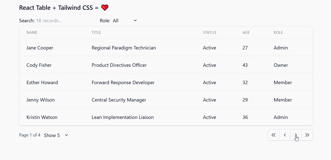
Just with these few modifications, it's already starting to look pretty good.

Style the pagination
Let's tackle the pagination next. Fortunately, Tailwind UI has got us covered again.
The way I usually work is I just paste the snippet next to the code I want to replace, to make sure it looks good and works in the context. So it would look like this.

The top pagination is just the styled snippet without any logic and functionality, the bottom one is the unstyled, functional one. Then I replace the content of the snippet step by step with the JavaScript logic, so that it actually works.
The pagination, as most UI designs, uses icons to guide the user. We'll use some neat icons provided by Heroicons. They are available as React components and you can install the package like this.
npm install @heroicons/react
Now, you can import the icons you want to use on the top of Table.js like this.
import { ChevronLeftIcon, ChevronRightIcon } from "@heroicons/react/solid";

// use like this
<ChevronLeftIcon className="h-5 w-5 text-blue-500" />;
To keep things short, I won't cover all the changes I made step-by-step. You will find the full result of this section below. But I encourage you to apply the changes step-by-step for yourself, so you get a better feel of how things work.
I've also added two button components and a utility class to make passing classnames to components easier.
// src/shared/Utils.js
export function classNames(...classes) {
  return classes.filter(Boolean).join(" ");
}
// src/shared/Button.js
import React from "react";
import { classNames } from "./Utils";

export function Button({ children, className, ...rest }) {
  return (
    <button
      type="button"
      className={classNames(
        "relative inline-flex items-center px-4 py-2 border border-gray-300 text-sm font-medium rounded-md text-gray-700 bg-white hover:bg-gray-50",
        className
      )}
      {...rest}
    >
      {children}
    </button>
  );
}

export function PageButton({ children, className, ...rest }) {
  return (
    <button
      type="button"
      className={classNames(
        "relative inline-flex items-center px-2 py-2 border border-gray-300 bg-white text-sm font-medium text-gray-500 hover:bg-gray-50",
        className
      )}
      {...rest}
    >
      {children}
    </button>
  );
}
So, here is the code for the styled pagination.
// src/Table.js
import { ChevronDoubleLeftIcon, ChevronLeftIcon, ChevronRightIcon, ChevronDoubleRightIcon } from '@heroicons/react/solid'
import { Button, PageButton } from './shared/Button'

function Table({ columns, data }) {
  // ...

  return (
    <>
      <div className="flex gap-x-2">
        <GlobalFilter
          // ...
        />
        {headerGroups.map((headerGroup) =>
          // ...
        )}
      </div>
      {/* table */}
      <div className="mt-2 flex flex-col">
        ...
      </div>
      {/* Pagination */}
      <div className="py-3 flex items-center justify-between">
        <div className="flex-1 flex justify-between sm:hidden">
          <Button onClick={() => previousPage()} disabled={!canPreviousPage}>Previous</Button>
          <Button onClick={() => nextPage()} disabled={!canNextPage}>Next</Button>
        </div>
        <div className="hidden sm:flex-1 sm:flex sm:items-center sm:justify-between">
          <div className="flex gap-x-2">
            <span className="text-sm text-gray-700">
              Page <span className="font-medium">{state.pageIndex + 1}</span> of {pageOptions.length}
            </span>
            <select
              value={state.pageSize}
              onChange={e => {
                setPageSize(Number(e.target.value))
              }}
            >
              {[5, 10, 20].map(pageSize => (
                <option key={pageSize} value={pageSize}>
                  Show {pageSize}
                </option>
              ))}
            </select>
          </div>
          <div>
            <nav className="relative z-0 inline-flex rounded-md shadow-sm -space-x-px" aria-label="Pagination">
              <PageButton
                className="rounded-l-md"
                onClick={() => gotoPage(0)}
                disabled={!canPreviousPage}
              >
                <span className="sr-only">First</span>
                <ChevronDoubleLeftIcon className="h-5 w-5" aria-hidden="true" />
              </PageButton>
              <PageButton
                onClick={() => previousPage()}
                disabled={!canPreviousPage}
              >
                <span className="sr-only">Previous</span>
                <ChevronLeftIcon className="h-5 w-5" aria-hidden="true" />
              </PageButton>
              <PageButton
                onClick={() => nextPage()}
                disabled={!canNextPage
                }>
                <span className="sr-only">Next</span>
                <ChevronRightIcon className="h-5 w-5" aria-hidden="true" />
              </PageButton>
              <PageButton
                className="rounded-r-md"
                onClick={() => gotoPage(pageCount - 1)}
                disabled={!canNextPage}
              >
                <span className="sr-only">Last</span>
                <ChevronDoubleRightIcon className="h-5 w-5" aria-hidden="true" />
              </PageButton>
            </nav>
          </div>
        </div>
      </div>
    </>
  )
}
Here is how it looks like in action and for different screen sizes. I've adjusted the initial design a bit to make it fit to the logic we've had in place. (Unfortunately the Gif doesn't capture the lighter gray colors properly, but you get the idea.)
Style the input elements
For the input elements (search field, filter drop-down and number-of-pages selector) we've relied on the default browser styling so far. Let's change that and make it fit to the rest of our design. I'll use another Tailwind plug-in for that: @tailwindcss/forms. Check out their live demo to see examples of styles you can achieve with it.
Install it with npm.
npm install @tailwindcss/forms
Then add it to your tailwind.config.js file:
// tailwind.config.js
module.exports = {
  theme: {
    // ...
  },
  plugins: [
    require("@tailwindcss/forms"),
    // ...
  ],
};
Let's apply some styling to the GlobalFilter component.
// src/Table.js
function GlobalFilter({...}) {
  // ...

  return (
    <label className="flex gap-x-2 items-baseline">
      <span className="text-gray-700">Search: </span>
      <input
        type="text"
        class="mt-1 block w-full rounded-md border-gray-300 shadow-sm focus:border-indigo-300 focus:ring focus:ring-indigo-200 focus:ring-opacity-50"
        value={value || ""}
        onChange={e => {
          setValue(e.target.value);
          onChange(e.target.value);
        }}
        placeholder={`${count} records...`}
      />
    </label>
  )
}
Same for the SelectColumnFilter component. I've also moved the label inside the component (note the import of the render function), to give it the same treatment like for the GlobalSearch component.
// src/Table.js
export function SelectColumnFilter({
  column: { ..., render },
}) {
  // ...

  return (
    <label className="flex gap-x-2 items-baseline">
      <span className="text-gray-700">{render("Header")}: </span>
      <select
        className="mt-1 block w-full rounded-md border-gray-300 shadow-sm focus:border-indigo-300 focus:ring focus:ring-indigo-200 focus:ring-opacity-50"
        name={id}
        id={id}
        value={filterValue}
        onChange={e => {
          setFilter(e.target.value || undefined)
        }}
      >
        <option value="">All</option>
        {options.map((option, i) => (
          <option key={i} value={option}>
            {option}
          </option>
        ))}
      </select>
    </label>
  )
}
Lastly we'll update the per-page selector in the pagination of the Table component.
// src/Table.js

// ...
<label>
  <span className="sr-only">Items Per Page</span>
  <select
    className="mt-1 block w-full rounded-md border-gray-300 shadow-sm focus:border-indigo-300 focus:ring focus:ring-indigo-200 focus:ring-opacity-50"
    value={state.pageSize}
    onChange={(e) => {
      setPageSize(Number(e.target.value));
    }}
  >
    {[5, 10, 20].map((pageSize) => (
      <option key={pageSize} value={pageSize}>
        Show {pageSize}
      </option>
    ))}
  </select>
</label>
// ...
Here is the result:

Custom cell components
Our table is coming together quite nicely. However, I'd like to be able to use custom components for different cells, e.g. a show a thumbnail of the user image with the name, or a nice color-coded pill indicating the status. Also, I'd like to be able to specify the component in the column definition.
This is actually pretty easy to achieve with React Table.
Let's implement a custom cell for the status.
// src/Table.js
export function StatusPill({ value }) {
  const status = value ? value.toLowerCase() : "unknown";

  return (
    <span
      className={classNames(
        "px-3 py-1 uppercase leading-wide font-bold text-xs rounded-full shadow-sm",
        status.startsWith("active") ? "bg-green-100 text-green-700" : null,
        status.startsWith("inactive") ? "bg-yellow-100 text-yellow-700" : null,
        status.startsWith("offline") ? "bg-red-100 text-red-700" : null
      )}
    >
      {status}
    </span>
  );
}
Let's import this in our App and use it in the column definition.
// src/App.js
import Table, { SelectColumnFilter, StatusPill } from "./Table"; // new

function App() {
  const columns = React.useMemo(
    () => [
      // ...
      {
        Header: "Status",
        accessor: "status",
        Cell: StatusPill, // new
      },
      // ...
    ],
    []
  );

  // ...
}
Here is the result. (I've also modified the data so we can see all three states.)

Isn't that cool? You can create your own custom cell components however complex, and just pass them to React Table. This is the greatness of React Table combined with the beauty of Tailwind CSS!
User avatar cell component
In the first column, I would like to show a user avatar and the email address. Let's write a component for this.
// src/Table.js
export function AvatarCell({ value, column, row }) {
  return (
    <div className="flex items-center">
      <div className="flex-shrink-0 h-10 w-10">
        <img
          className="h-10 w-10 rounded-full"
          src={row.original[column.imgAccessor]}
          alt=""
        />
      </div>
      <div className="ml-4">
        <div className="text-sm font-medium text-gray-900">{value}</div>
        <div className="text-sm text-gray-500">
          {row.original[column.emailAccessor]}
        </div>
      </div>
    </div>
  );
}
The AvatarCell takes two additional props as arguments, column and row. This is useful, because it allows you to use extra data from the object and use it within the cell.
Here is the column config:
// src/App.js
function App() {
  const columns = React.useMemo(() => [
    {
      Header: "Name",
      accessor: "name",
      Cell: AvatarCell,
      imgAccessor: "imgUrl",
      emailAccessor: "email",
    },
    // ...
  ]);

  // ...
}
In order to keep things configurable, we're using extra options, imgAccessor and emailAccessor, so we can easily update that in case the API schema changes.
I've also made another quick change to the Table UI. If no specific Cell is provided with the column options, I want to apply some extra styles to make the text smaller and the color a medium gray.
// src/Table.js
function Table({ columns, data }) {
  // ...

  return (
    // ...
    <td
      {...cell.getCellProps()}
      className="px-6 py-4 whitespace-nowrap"
      role="cell"
    >
      {cell.column.Cell.name === "defaultRenderer" ? (
        <div className="text-sm text-gray-500">{cell.render("Cell")}</div>
      ) : (
        cell.render("Cell")
      )}
    </td>
    // ...
  );
}
Here is the result:
Note: It is possible to create clickable cells using a similar technique, so a click on a cell / row would open e.g. a detail page for this row. This can be achieved e.g. with React Router by passing a url and id as options and using a within the cell component.
Update sort icons
One last thing before we wrap this up. The sort icons in the headers don't really fit to the rest of the design, so let's replace them. Unfortunately, I coudn't find what I was looking for in Heroicons. So, here is a set of svg icon components that I'd like to use. I've put them in a separate file.
// src/shared/Icons.js
export function SortIcon({ className }) {
  return (
    <svg className={className} stroke="currentColor" fill="currentColor" strokeWidth="0" viewBox="0 0 320 512" height="1em" width="1em" xmlns="http://www.w3.org/2000/svg"><path d="M41 288h238c21.4 0 32.1 25.9 17 41L177 448c-9.4 9.4-24.6 9.4-33.9 0L24 329c-15.1-15.1-4.4-41 17-41zm255-105L177 64c-9.4-9.4-24.6-9.4-33.9 0L24 183c-15.1 15.1-4.4 41 17 41h238c21.4 0 32.1-25.9 17-41z"></path>
  )
}

export function SortUpIcon({ className }) {
  return (
    <svg className={className} stroke="currentColor" fill="currentColor" strokeWidth="0" viewBox="0 0 320 512" height="1em" width="1em" xmlns="http://www.w3.org/2000/svg"><path d="M279 224H41c-21.4 0-32.1-25.9-17-41L143 64c9.4-9.4 24.6-9.4 33.9 0l119 119c15.2 15.1 4.5 41-16.9 41z"></path>
  )
}

export function SortDownIcon({ className }) {
  return (
    <svg className={className} stroke="currentColor" fill="currentColor" strokeWidth="0" viewBox="0 0 320 512" height="1em" width="1em" xmlns="http://www.w3.org/2000/svg"><path d="M41 288h238c21.4 0 32.1 25.9 17 41L177 448c-9.4 9.4-24.6 9.4-33.9 0L24 329c-15.1-15.1-4.4-41 17-41z"></path>
  )
}
With that, let's modify the part of the JSX in the Table UI where the table headers are rendered like this:
// src/Table.js
function Table({ columns, data }) {
  //...

  return (
    // ...
    <th
      scope="col"
      className="group px-6 py-3 text-left text-xs font-medium text-gray-500 uppercase tracking-wider"
      {...column.getHeaderProps(column.getSortByToggleProps())}
    >
      <div className="flex items-center justify-between">
        {column.render('Header')}
        {/* Add a sort direction indicator */}
        <span>
          {column.isSorted
            ? column.isSortedDesc
              ? <SortDownIcon className="w-4 h-4 text-gray-400" />
              : <SortUpIcon className="w-4 h-4 text-gray-400" />
            : (
              <SortIcon className="w-4 h-4 text-gray-400 opacity-0 group-hover:opacity-100" />
            )}
        </span>
      </div>
    </th>
    // ...
  )
}
I've used a little trick, the group-hover prefix, to toggle the display of the
Here is the result:
Conclusion
Phew, that was quite a lot! But I'm quite happy with the result. I hope you like it, too. Any questions or feedback let me know in the comments below. Many thanks!