
In this tutorial you'll build a powerful and customizable table component with React and React Table. Here is how the final result will look like:
In this first part I'll cover the implementation of the features (text search, filtering, sorting and pagination) with React Table. In the second part, we'll look into how to give the table a modern design with Tailwind CSS.
You can find the full source code for the first part of the tutorial on GitHub.
What is React Table?
Displaying data in form of a table with columns and rows is a common use-case that is required in almost any web application. In order to be useful, especially when there's lots of data, tables need to have features like search, filters, and sorting, so the user can find the data he or she is interested in quickly.
Many solutions have come up for this use-case over the years (e.g. check this article for a collection of those). However, most of these options are only free for non-commercial use. Another disadvantage is that all of these solutions come with a pre-defined design and allow for only very little customization.
More recently, new UI libraries have come up that refer to themselves headless. Headless UI libraries provide some sort of abstracted logic and functionality for very common use-cases (like tables, drop-downs, modals etc.), while at the same time giving the developer full flexibility in customizing the behavior and the design almost any way he or she wants to.
On of these libraries is the React Table by TanStack. React Table provides an amazing developer experience, because it feels very much like React and it is has superb documentation. And the best - it's MIT licensed, which means it's completely free to use.
In this article I'll walk you though a simple, but powerful implementation of React Table, adding common features like search, filtering, sorting and pagination step by step. By the end you'll have a completely functional React table component you can use in you projects and modify to your liking. Sounds good? Okay, let's go!
Note: I am assuming that you already have some familiarity with React before following this tutorial. Have a look at this article for how to get started with React.
Setup
Create a new React project.
npx create-react-app --use-npm react-tailwind-table
Let's start by scaffolding our app, creating some dummy data (which I borrowed from tailwindui.com) and specifying the column definitions of the data we want to show in our table. For that, replace the content of src/App.js with the following.
// src/App.js
import React from "react";
import Table from "./Table";

const getData = () => [
  {
    name: "Jane Cooper",
    email: "jane.cooper@example.com",
    title: "Regional Paradigm Technician",
    department: "Optimization",
    status: "Active",
    role: "Admin",
    imgUrl:
      "https://images.unsplash.com/photo-1494790108377-be9c29b29330?ixlib=rb-1.2.1&ixid=eyJhcHBfaWQiOjEyMDd9&auto=format&fit=facearea&facepad=4&w=256&h=256&q=60",
  },
  {
    name: "Cody Fisher",
    email: "cody.fisher@example.com",
    title: "Product Directives Officer",
    department: "Intranet",
    status: "Active",
    role: "Owner",
    imgUrl:
      "https://images.unsplash.com/photo-1570295999919-56ceb5ecca61?ixlib=rb-1.2.1&ixid=eyJhcHBfaWQiOjEyMDd9&auto=format&fit=facearea&facepad=4&w=256&h=256&q=60",
  },
  {
    name: "Esther Howard",
    email: "esther.howard@example.com",
    title: "Forward Response Developer",
    department: "Directives",
    status: "Active",
    role: "Member",
    imgUrl:
      "https://images.unsplash.com/photo-1520813792240-56fc4a3765a7?ixlib=rb-1.2.1&ixid=eyJhcHBfaWQiOjEyMDd9&auto=format&fit=facearea&facepad=4&w=256&h=256&q=60",
  },
  {
    name: "Jenny Wilson",
    email: "jenny.wilson@example.com",
    title: "Central Security Manager",
    department: "Program",
    status: "Active",
    role: "Member",
    imgUrl:
      "https://images.unsplash.com/photo-1498551172505-8ee7ad69f235?ixlib=rb-1.2.1&ixid=eyJhcHBfaWQiOjEyMDd9&auto=format&fit=facearea&facepad=4&w=256&h=256&q=60",
  },
  {
    name: "Kristin Watson",
    email: "kristin.watson@example.com",
    title: "Lean Implementation Liaison",
    department: "Mobility",
    status: "Active",
    role: "Admin",
    imgUrl:
      "https://images.unsplash.com/photo-1532417344469-368f9ae6d187?ixlib=rb-1.2.1&ixid=eyJhcHBfaWQiOjEyMDd9&auto=format&fit=facearea&facepad=4&w=256&h=256&q=60",
  },
  {
    name: "Cameron Williamson",
    email: "cameron.williamson@example.com",
    title: "Internal Applications Engineer",
    department: "Security",
    status: "Active",
    role: "Member",
    imgUrl:
      "https://images.unsplash.com/photo-1566492031773-4f4e44671857?ixlib=rb-1.2.1&ixid=eyJhcHBfaWQiOjEyMDd9&auto=format&fit=facearea&facepad=4&w=256&h=256&q=60",
  },
];

function App() {
  const columns = React.useMemo(
    () => [
      {
        Header: "Name",
        accessor: "name",
      },
      {
        Header: "Title",
        accessor: "title",
      },
      {
        Header: "Status",
        accessor: "status",
      },
      {
        Header: "Role",
        accessor: "role",
      },
    ],
    []
  );

  const data = React.useMemo(() => getData(), []);

  return (
    <>
      <h1>Hello React!</h1>
      <div>
        <Table columns={columns} data={data} />
      </div>
    </>
  );
}

export default App;
If you run npm start, the compile will fail as we haven't defined the Table component yet. Let's tackle that next.
Basic table
Install React Table in you project.
npm install react-table
Create a new file src/Table.js. We'll mostly use the code of the basic example from the React Table docs.
// src/Table.js
import React from "react";
import { useTable } from "react-table";

function Table({ columns, data }) {
  // Use the state and functions returned from useTable to build your UI
  const { getTableProps, getTableBodyProps, headerGroups, rows, prepareRow } =
    useTable({
      columns,
      data,
    });

  // Render the UI for your table
  return (
    <table {...getTableProps()} border="1">
      <thead>
        {headerGroups.map((headerGroup) => (
          <tr {...headerGroup.getHeaderGroupProps()}>
            {headerGroup.headers.map((column) => (
              <th {...column.getHeaderProps()}>{column.render("Header")}</th>
            ))}
          </tr>
        ))}
      </thead>
      <tbody {...getTableBodyProps()}>
        {rows.map((row, i) => {
          prepareRow(row);
          return (
            <tr {...row.getRowProps()}>
              {row.cells.map((cell) => {
                return <td {...cell.getCellProps()}>{cell.render("Cell")}</td>;
              })}
            </tr>
          );
        })}
      </tbody>
    </table>
  );
}

export default Table;
Run npm start to open the app in the browser. You should see this.

Take a look at the Table component to see what's going on. You will find the standard HTML table markup with It's working, even though I admit it's not very exiting yet. The power of React table starts when we add in things like sorting, filtering, pagination, columns ordering, and all the other features React Table. Check out their documentation and comprehensive examples to find out more about what you can do. First, let's add a global search feature to our table, so that when a user types in some text into an input field, the table only displays rows with data that matches this text. In the The It also defines Finally, make a few updates to the Here, we need to unpack a few more variables from the Then, we render the Try out the search functionality in the browser. Let's add a filter, so the user can filter the data by role with a dropdown instead of having to type. Start with the following import, so we can use the column filter functionality from React Table. Next, let's create a Let's also update the Table component to display the new filter component. First, we're passing the In order to keep things configurable, we're not hard-coding the filter into the Table component. Instead, we'll pass the filter with the column definition, which I'll cover shortly when we look at In order to render the filter components, we're looping over the I've also added a snippet just below , , , and
, to display the value of for table header, body, rows and cells, respectively. The code is using the JavaScript .map() array method to loop over the items of table headers, rows and columns to render the markup. On top of that there are a few things that React table needs in order to do it's job, like getTableProps(), prepareRow(row) etc. Finally the content of a header or cell is rendered with cell.render('Cell').
Global search
src/Table.js, by adding the following code to it.import { useTable, useGlobalFilter, useAsyncDebounce } from 'react-table' // new
// Define a default UI for filtering
function GlobalFilter({
preGlobalFilteredRows,
globalFilter,
setGlobalFilter,
}) {
const count = preGlobalFilteredRows.length
const [value, setValue] = React.useState(globalFilter)
const onChange = useAsyncDebounce(value => {
setGlobalFilter(value || undefined)
}, 200)
return (
<span>
Search:{' '}
<input
value={value || ""}
onChange={e => {
setValue(e.target.value);
onChange(e.target.value);
}}
placeholder={`${count} records...`}
/>
</span>
)
}
...
GlobalFilter component accepts a few props that will be provided by the Table component.value using the useState hook, which is coupled to the element's value. When the user types in the element, the onChange handler will call the setGlobalFilter method to pass the value to the parent Table component. The useAsyncDebounce is used to add a little delay to avoid too many re-renders while the user is typing.Table component to integrate the GlobalFilter.function Table({ columns, data }) {
// Use the state and functions returned from useTable to build your UI
const {
...
state, // new
preGlobalFilteredRows, // new
setGlobalFilter, // new
} = useTable({
columns,
data,
},
useGlobalFilter // new
)
// Render the UI for your table
return (
<>
<GlobalFilter
preGlobalFilteredRows={preGlobalFilteredRows}
globalFilter={state.globalFilter}
setGlobalFilter={setGlobalFilter}
/>
<table {...getTableProps()} border="1">
...
</table>
</>
)
}
useTable hook, such as state. We also pass useGlobalFilter as an argument to that hook.GlobalFilter component within the Table UI.
Drop-down filter
// src/Table.js
import { ..., useFilters} from 'react-table'
SelectColumnFilter component, as provided by the React Table example.// src/Table.js
// This is a custom filter UI for selecting
// a unique option from a list
export function SelectColumnFilter({
column: { filterValue, setFilter, preFilteredRows, id },
}) {
// Calculate the options for filtering
// using the preFilteredRows
const options = React.useMemo(() => {
const options = new Set();
preFilteredRows.forEach((row) => {
options.add(row.values[id]);
});
return [...options.values()];
}, [id, preFilteredRows]);
// Render a multi-select box
return (
<select
name={id}
id={id}
value={filterValue}
onChange={(e) => {
setFilter(e.target.value || undefined);
}}
>
<option value="">All</option>
{options.map((option, i) => (
<option key={i} value={option}>
{option}
</option>
))}
</select>
);
}
function Table({ columns, data }) {
// Use the state and functions returned from useTable to build your UI
const {
...
} = useTable({
columns,
data,
},
useFilters, // new
useGlobalFilter,
)
// Render the UI for your table
return (
<>
<GlobalFilter
...
/>
{/* new */}
{headerGroups.map((headerGroup) =>
headerGroup.headers.map((column) =>
column.Filter ? (
<div key={column.id}>
<label for={column.id}>{column.render("Header")}: </label>
{column.render("Filter")}
</div>
) : null
)
)}
<table {...getTableProps()} border="1">
...
</table>
<div>
{/* new */}
<pre>
<code>{JSON.stringify(state, null, 2)}</code>
</pre>
</div>
</>
)
}
useFilter as an additional argument to the useTable hook. Note that the order of useFilter and useGlobalFilter matters. In our case, useFilter is applied first, so the globalFilter text search is only applied on whatever rows are selected by useFilter. This performs better, especially for larger amounts of data, because it reduces the number of rows that have to be included in the text search.src/App.js.headerGroups and columns and then render a label as well as the filter component itself.state, so we can better understand how it's used by React Table keep track of the user input.
Update src/App.js as follows.
// src/App.js
import Table, {SelectColumnFilter} from './Table'
...
function App() {
const columns = React.useMemo(() => [
...
{
Header: "Role",
accessor: 'role',
Filter: SelectColumnFilter, // new
filter: 'includes', // new
},
], [])
...
}
We're importing the SelectColumnFilter component and then add it as a Filter to the Role column. That's all we need to do. This approach allows us to add different filter components later (e.g. NumberRangeColumnFilter etc.), if we want to, and then include them in the column definition just like that, without having to touch the Table component itself. Neat, right?
Let's see this in action!
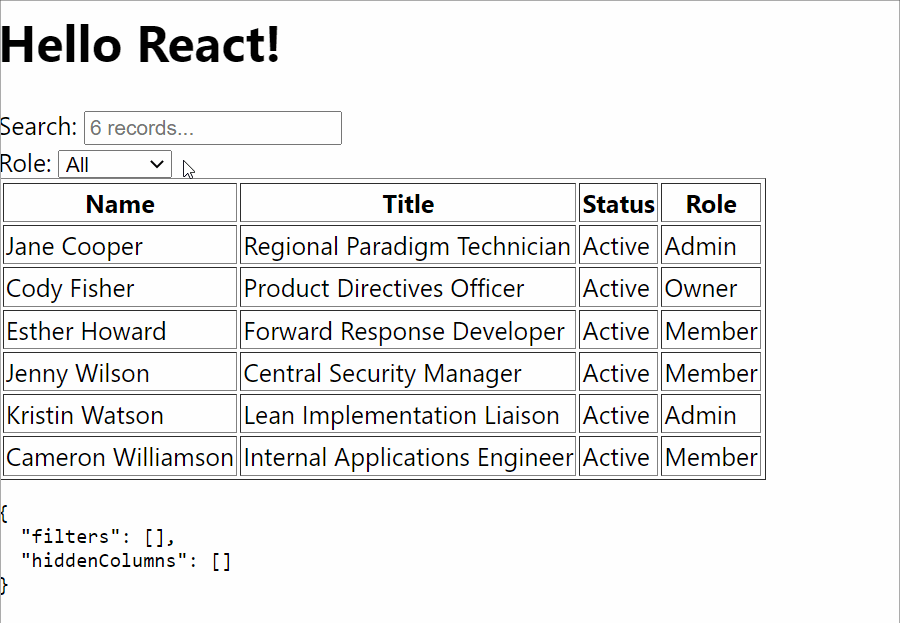
Works like a charm! Note how state changes when you type into the search field or select a different option. This is how React Table communicates the current state with it's components.
Sorting
Let's add another useful feature: Sorting. When the user clicks on a column header, we would like to sort the data in that column in ascending order. Another click should toggle the order from ascending to descending. With React table, this is actually really easy!
// src/Table.js
import { ..., useSortBy } from 'react-table' // new
function Table({ columns, data }) {
// Use the state and functions returned from useTable to build your UI
const {
...
} = useTable({columns, data,},
...
useSortBy, // new
)
// Render the UI for your table
return (
<>
...
<table {...getTableProps()} border="1">
<thead>
{headerGroups.map(headerGroup => (
<tr {...headerGroup.getHeaderGroupProps()}>
{headerGroup.headers.map(column => (
// Add the sorting props to control sorting. For this example
// we can add them into the header props
<th {...column.getHeaderProps(column.getSortByToggleProps())}>
{column.render('Header')}
{/* Add a sort direction indicator */}
<span>
{column.isSorted
? column.isSortedDesc
? ' ▼'
: ' ▲'
: ''}
</span>
</th>
))}
</tr>
))}
</thead>
<tbody {...getTableBodyProps()}>
...
</tbody>
</table>
...
</>
)
}
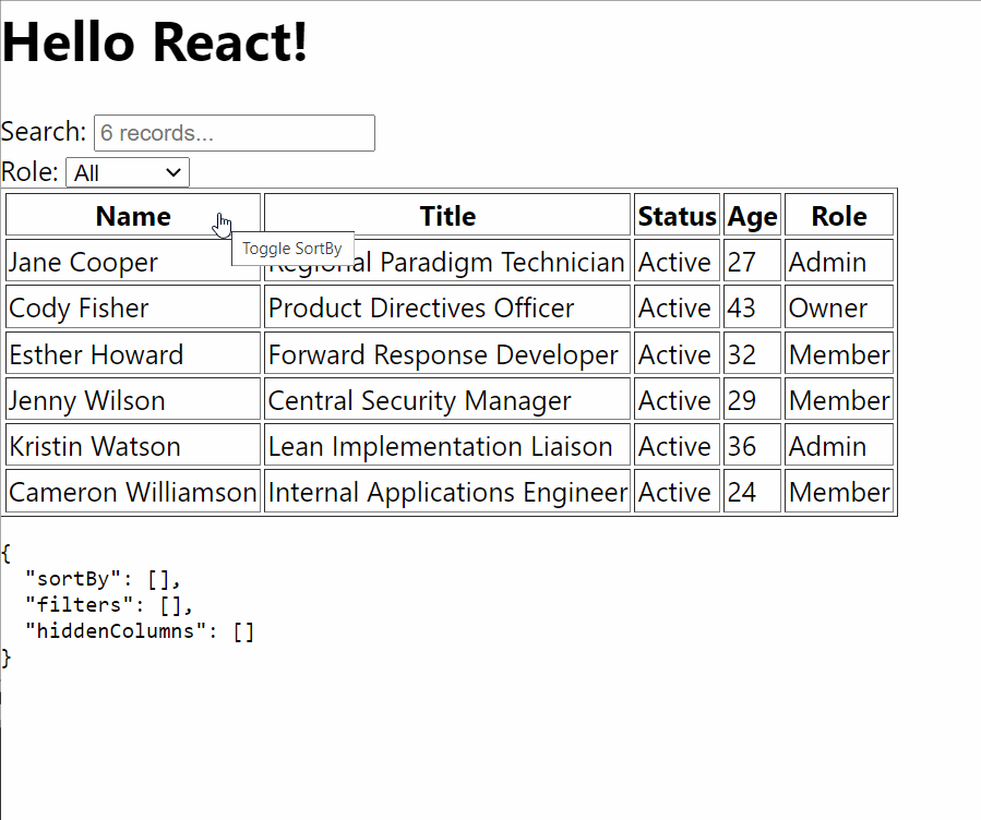
First, we have to import useSorting. Then we just modify the table header column.getSortByToggleProps() to column.getHeaderProps(). We also add a
In order to make demonstrating the sorting easier, I've also added a new Age column to our table.
// src/App.js
const getData = () => [
{
name: 'Jane Cooper',
...
age: 27,
},
...
]
function App() {
const columns = React.useMemo(() => [
...
{
Header: "Age",
accessor: 'age',
},
...
], [])
...
}
Here is how the result looks like. Of course, sorting and filtering also work when combined. React Table is doing all the work for us here.
Pagination
The last feature I want to implement is pagination. React Table supports both server-side and client-side pagination. However, in this article I'll only cover client-side.
To implement pagination, make the following changes (all of which are copied from the React Table pagination example).
// src/Table.js
import { ..., usePagination } from 'react-table' // new
function Table({ columns, data }) {
// Use the state and functions returned from useTable to build your UI
const {
getTableProps,
getTableBodyProps,
headerGroups,
prepareRow,
//new
page, // Instead of using 'rows', we'll use page,
// which has only the rows for the active page
// The rest of these things are super handy, too ;)
canPreviousPage,
canNextPage,
pageOptions,
pageCount,
gotoPage,
nextPage,
previousPage,
setPageSize,
state,
preGlobalFilteredRows,
setGlobalFilter,
} = useTable({
columns,
data,
},
useFilters,
useGlobalFilter,
useSortBy,
usePagination, // new
)
// Render the UI for your table
return (
<>
...
<table {...getTableProps()} border="1">
...
<tbody {...getTableBodyProps()}>
{page.map((row, i) => { // replace row with page
...
})}
</tbody>
</table>
{/* new */}
<div className="pagination">
<button onClick={() => gotoPage(0)} disabled={!canPreviousPage}>
{'<<'}
</button>{' '}
<button onClick={() => previousPage()} disabled={!canPreviousPage}>
{'<'}
</button>{' '}
<button onClick={() => nextPage()} disabled={!canNextPage}>
{'>'}
</button>{' '}
<button onClick={() => gotoPage(pageCount - 1)} disabled={!canNextPage}>
{'>>'}
</button>{' '}
<span>
Page{' '}
<strong>
{state.pageIndex + 1} of {pageOptions.length}
</strong>{' '}
</span>
<select
value={state.pageSize}
onChange={e => {
setPageSize(Number(e.target.value))
}}
>
{[5, 10, 20].map(pageSize => (
<option key={pageSize} value={pageSize}>
Show {pageSize}
</option>
))}
</select>
</div>
...
</>
)
}
Note that we've replaced row with page, which is an object provided by React Table that only contains the data for the current page.
In order to properly demo the pagination properly, we need a bit more data, so let's modify the getData function to concatenate the initial array three times using the JavaScript spread operator ..., before returning it.
// src/App.js
const getData = () => {
const data = [
...
]
return [...data, ...data, ...data]
}
Let's see pagination in action.

Conclusion
That's it for the first part. I hope I've been able to give you a feel of how powerful and easy-to-use React Table is. If you have any questions or feedback, let me know in the comments below.
In the second part of this tutorial, I will show how to give this table a modern design using Tailwind CSS. See you there!