
Introduction
This is the second part of a series of blog posts in which I explain how to build a Covid-19 vaccination dashboard from the ground up using Django and Chart.js.
In this article I'll show how to
- add a pie chart with Chart.js showing the most widely used vaccine combinations,
- integrate Tailwind CSS to style the dashboard and make it responsive, and
- implement a data table of the latest data per country with Grid.js.
If you haven't already, check out the first article of this series, where I show how to set up the Django project, configure the data model, implement a custom command to import the data, integrate Chart.js and fetch the data asynchronously with JavaScript.
The code for this article can be found on Github: Starter code (from the end of the previous article), completed code (from the end of this article)
Update the dataset
Before continuing to implement new features, let's first update the data in the database with the custom command created in the previous article. Get the latest version of the dataset from Kaggle and put the file country_vaccinations.csv into the data directory.
Before running the command, you'll need to remove all the records that are already in the database to avoid ending up with duplicates. Run the following commands to start the Django shell.
$ source venv/bin/activate    (on Mac)
$ venv/Source/activate        (on Windows)
(venv) $ python manage.py shell
Import the model Entry and delete all the records in this table.
from dashboard.models import Entry
Entry.objects.all().delete()
# (10889, {'dashboard.Entry': 10889})
quit()
Now you're good to go to run the custom management command again.
(venv) $ python manage.py seed
# Successfully seeded database.
Start the development server and open your app in the browser.
(venv) $ python manage.py runserver
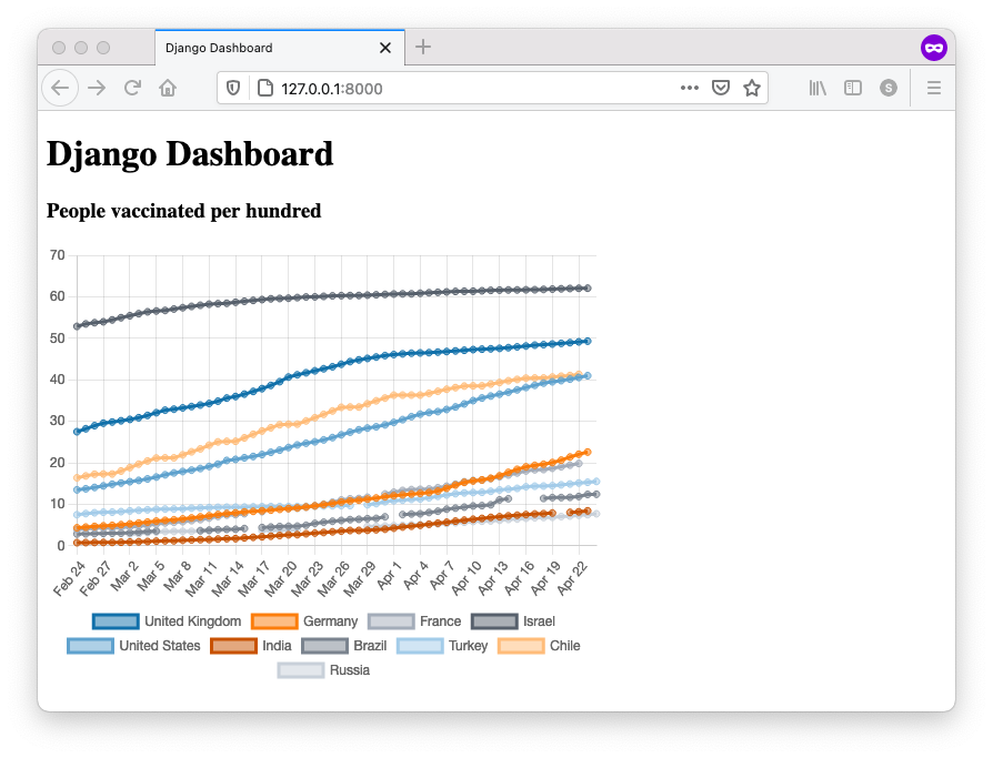
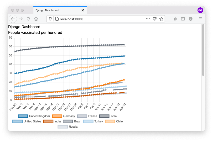
The data shown in the chart should now be up-to-date.
Note: If you want, you can extend your custom management command to automate the steps of downloading the dataset and cleaning the table before re-importing. You'll need to use the Kaggle API to download the dataset programmatically. Check out this article for a step by step explanation.
Endpoint for the pie chart data
Let's work on adding a pie chart to our dashboard, showing the percentage of vaccines from different manufacturers. Our dataset contains a column specifying the combinations of different vaccine manufacturers for each date/country. To display the data in a pie chart, we'll need to aggregate the rows to calculate the sum per combination.
Note: The Kaggle dataset also contains an additional file with numbers of vaccines per individual manufacturer. Using this data would allow for a more detailed analysis. However, I'm not going to cover that for the sake of brevity, but feel free to extend and modify the app with an additional model if you want. Let me know how that goes in the comments below.
Create a new view piechart at the bottom of your dashboard/views.py file.
# dashboard/views.py
from django.db.models import Sum

def piechart(request):
    total_vaccines = Entry.objects.all().aggregate(Sum("daily_vaccinations"))[
        "daily_vaccinations__sum"
    ]
    qs = (
        Entry.objects.values("vaccines")
        .annotate(total=Sum("daily_vaccinations"))
        .order_by("-total")[:9]
    )
    # calculate percentage and rest
    combinations = {
        entry["vaccines"]: (entry["total"] / total_vaccines) for entry in qs
    }
    combinations["other"] = 1 - sum(entry["total"] for entry in qs) / total_vaccines
    return JsonResponse(data={"combinations": combinations})
In order to calculate the percentage of each vaccine combination, we need the total number of vaccines, which we're getting by using the .aggregate() method from the Django ORM to calculate the sum of the field daily_vaccinations over all entries.
For each of the vaccine combinations, we need the to sum up the daily vaccinations. To do that, we're using the the .value() method from the Django ORM to get the distinct vaccine combinations and the .annotate() method to annotate each value with a new field. In our case we're calculating the sum of the field daily_vaccinations over all entries of each combination. Lastly, we order the results by our new total field in descending order. To avoid too many different combinations in the chart, we only consider the largest nine combinations.
Note: When figuring out complex queries like this, I prefer to build them step by step in the Django shell. That way, the results of each modification to the query can be checked instantly.
In the last step the number of each combination is divided by the total number of vaccines in order to calculate the percentage. The is done by using the dictionary comprehension feature of Python. The last key other in the dictionary takes the percentage of the rest of vaccine combinations in order to get to 100%.
Add the view to the urlpatterns.
# dashboard/urls.py
urlpatterns = [
    ...
    path('piechart', views.piechart, name='piechart'),
]
Go to the url to check the results.
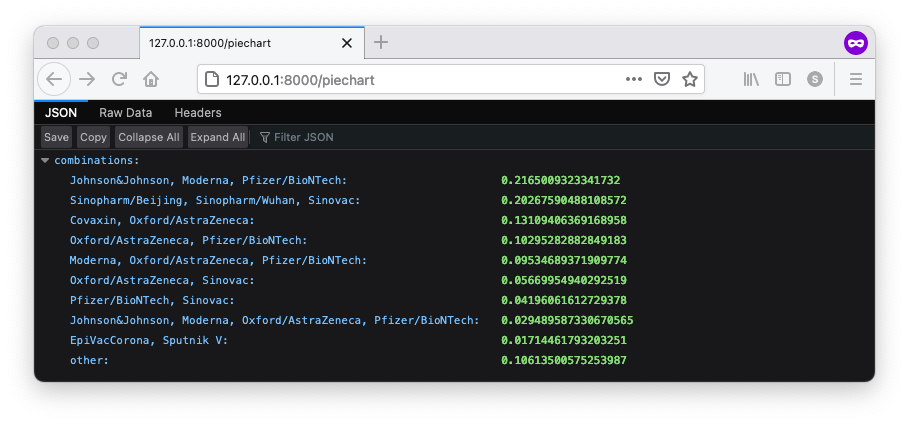
Looking good!
Render the pie chart on the template
To display the pie chart on the dashboard, two things need to be done:
- Add a canvas element to the template.
- Write some JavaScript to fetch the data from the endpoint and render the chart.
In the home.html template, add a new canvas element in the markup. Also, within the script tag at the bottom, create a reference to that canvas element and call the function drawPieChart(). We'll cover this function shortly.
Here is how the template looks like now.
{% extends 'base.html' %}
{% load static %}
{% block content %}

<h1>Django Dashboardh1>

<h3>People vaccinated per hundredh3>
<div style="height: 400px; width: 500px;">
  <canvas id="lineChart" data-url="{% url 'linechart' %}">canvas>
div>

<h3>Most widely used vaccine combinationsh3>
<div style="height: 400px; width: 500px;">
  <canvas id="pieChart" data-url="{% url 'piechart' %}"> canvas>
div>

<script
  src="https://cdnjs.cloudflare.com/ajax/libs/Chart.js/3.1.0/chart.min.js"
  integrity="..."
  crossorigin="anonymous"
>script>
<script src="https://cdn.jsdelivr.net/npm/chartjs-adapter-date-fns@next/dist/chartjs-adapter-date-fns.bundle.min.js">script>
<script src="{% static 'js/charts.js' %}">script>

<script>
  let lineChart = document.getElementById("lineChart");
  let pieChart = document.getElementById("pieChart");  // new

  drawLineChart(lineChart)
  drawPieChart(pieChart)  // new
script>

{% endblock %}
To fetch the data and render the pie chart to the template, add the following function to your charts.js file.
// static/js/charts.js
...

function drawPieChart(canvas) {
  let url = canvas.dataset.url;
  let ctx = canvas.getContext("2d");

  fetch(url)
    .then((response) => response.json())
    .then((data) => {
      new Chart(ctx, {
        type: "pie",
        data: {
          datasets: [
            {
              data: Object.values(data.combinations).map((value) =>
                (value * 100).toFixed(1)
              ),
              backgroundColor: COLORS,
              label: "Most widely used vaccine combinations",
            },
          ],
          labels: Object.keys(data.combinations),
        },
        options: {
          legend: {
            position: "bottom",
          },
          maintainAspectRatio: false,
        },
      });
    })
    .catch((error) => {
      console.error("Error:", error);
    });
}
The function drawPiechart() is very similar to the drawLinechart() you've already implemented in the previous article. Feels free to go back and have a look if you're unsure how it works.
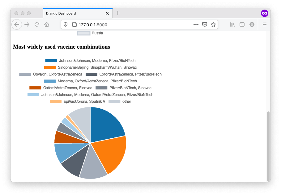
You should now be able so see the pie chart on the dashboard. Note that Chart.js displays the value for each segment when you hover over it with the cursor.
Integrate Tailwind CSS and add styling
Now that there are two charts on the dashboard, let's look into adding some styles and also make it responsive, so that it adapts to different screen sizes/devices.
When it comes to styling a website or app, I am a big fan of Tailwind CSS. I use it in almost every project I work on, because it is easy to use and it provides a ton of flexibility to create beautiful custom designs. It's well documented and there are tons of snippets and examples you can refer to (e.g. Tailwind UI, Tailwind Components and Meraki UI).
When using Tailwind CSS in a Django project, I like to use the package django-tailwind. It takes care of most of the configuration and integrates it nicely with the Django project.
Follow the steps in the installation instructions of django-tailwind, which should be straight forward. When running the command python manage.py tailwind init, you can just accept the defaults (jit mode and app name theme). In case you're wondering, JIT (just-in-time) mode means that instead of having a large CSS file containing all the possible utility classes for development, Tailwind will automatically build a minimal CSS file containing just the classes you need while you're developing!
In step 9, as you already have your own base.html in the templates directory, just integrate the two custom tags in your own base.html like this.
{% load tailwind_tags %}


<html lang="en">
  <head>
    <meta charset="UTF-8" />
    <meta http-equiv="X-UA-Compatible" content="IE=edge" />
    <meta name="viewport" content="width=device-width, initial-scale=1.0" />
    <title>Django Dashboardtitle>
    {% tailwind_css %}
  head>
  <body>
    {% block content %}
    {% endblock %}
	body>
html>
After running python manage.py tailwind start in a separate console, a process will monitor your templates and hot-reload them in the browser every time you make a change. No need to refresh the browser manually any more - pretty neat!
After that, also restart the Django development server in the other console (hit CTRL + C, run python manage.py startserver).
When you open the app in the browser, you'll see that all the font styles have changed to a base-line style using a sans-serif font and standard text size.
Note: If you're using VS Code, check out the amazing Tailwind CSS Intellisense extension! It will suggest and autocomplete Tailwind CSS utility classes, which makes working with Tailwind CSS even greater. They've recently added support for the JIT mode as well!.
Let's applying some Tailwind classes to make the background light gray, the default text color dark gray, and apply some padding. Also wrap the {% block content %} in a centered container.
...
  <body class="bg-gray-200 text-gray-900 font-sans leading-normal tracking-normal py-4 px-4 sm:px-6">
		<div class="container mx-auto">
			{% block content %}
    	{% endblock %}
		div>
	body>
...
The browser should now auto-refresh the page. You should be able to see the slightly off-white background.
Also, try resizing your browser window. You'll see that the content width only changes at certain breakpoints (that's what the container utility class does).
Let's head over to the home.html file and apply some styles.
...
<h1 class="text-lg font-bold">Covid-19 Vaccination Dashboardh1>
<p class="text-gray-500">Build with Django, Chart.js, Grid.js and Tailwindp>

<div class="mt-4 grid gap-4 gris-cols-1 lg:grid-cols-2">
  <div class="bg-white sm:rounded-md shadow -mx-4 sm:mx-0 px-4 py-3">
    <h3 class="font-medium">People vaccinated per hundredh3>
    <div class="mt-2 h-96">
      <canvas id="lineChart" data-url="{% url 'linechart' %}">canvas>
    div>
  div>

  <div class="bg-white sm:rounded-md shadow -mx-4 sm:mx-0 px-4 py-3">
    <h3 class="font-medium">Most widely used vaccine combinationsh3>
    <div class="mt-2 h-96">
      <canvas id="pieChart" data-url="{% url 'piechart' %}">canvas>
    div>
  div>
div>
...
The headings and the text have been given a hierarchy through text size, color and weight. The charts have been wrapped in cards using grid. On small screens, the grid only has one column, so the cards will stack. On large screens the grid will switch to two columns, so the cards will be side-by-side.
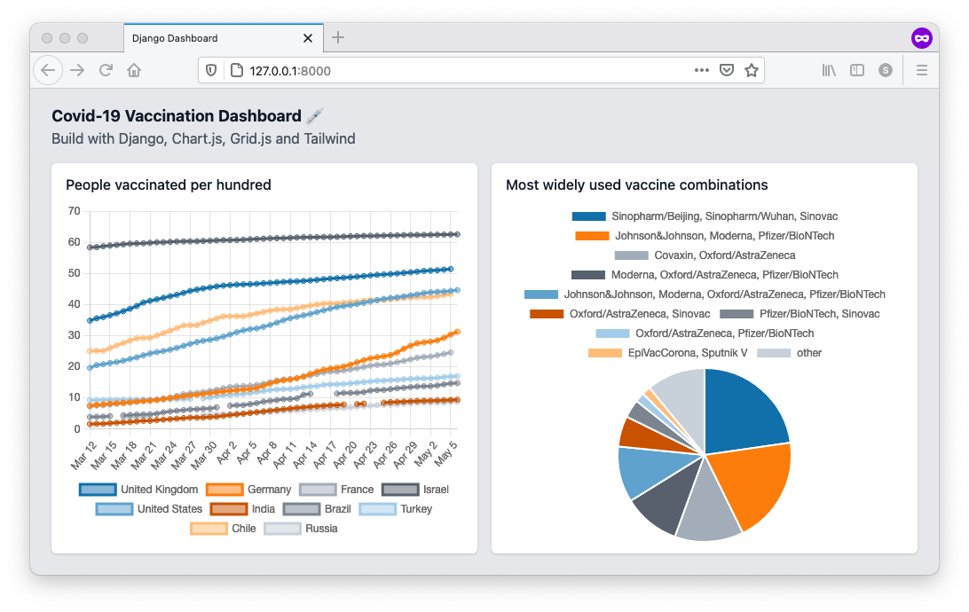
By adding ust a few Tailwind utility classes the look-and-feel of the Dashboard has improved quite a bit. Note how the cards stack when you reduce the width of the browser window.
Note: For some reason, when reducing the window width, at a certain point the charts' width is not adjusted anymore. I haven't been able to figure out how to make it fully responsive. However you can give the charts the appropriate width by refreshing the page.
Endpoint for most recent country data
The last feature to implement is a data grid to show the latest numbers for all the countries. While a simple html table could be used to render the data in a Django template, I would like to have something more dynamic, e.g. to allow the user to sort the data by column.
A nice option for that is Grid.js. Similar to the Chart.js integration, we need to set up a separate data endpoint and write a little bit of JavaScript to load the data and render the grid.
Let's start with the endpoint. The goal is to get the latest entry for each country. As you'll see, this one is a bit tricky.
# dashboard/views.py
from django.db.models import Subquery, OuterRef, F, Sum

def table(request):
    qs = Entry.objects.all()
    sq = qs.filter(country=OuterRef('country')) \
        .order_by('-date').values('id')
    qs2 = qs.annotate(latest=Subquery(sq[:1])) \
        .filter(id=F('latest')) \
        .order_by('-people_vaccinated_per_hundred')
    return JsonResponse(data={'data': list(qs2.values())})
After doing a bit of research I finally found a solution for this on Stackoverflow. A similar example (which I find a bit easier to follow) can be found in the Django docs.
So what's going on here? Each entry of qs2 is annotated with the id of the latest entry of that same country using a subquery. Then, the queryset is filtered to select only the entries where the id is equal to latest. A bit cumbersome, but it does the job. (If you come up with a better solution that also works with SQLite, please let me know in the comments!)
Head over to urls.py to add the view to the urlpatterns.
# dashboard/urls.py
...
urlpatterns = [
    ...
    path('table', views.table, name='table'),
]
Enter the url http://localhost:8000/table in your browser to see the response.

Mmh, the data is looking okay. But ouch! - that SQL query took ages (~23 secs for me). To see the stats, open the network tab in the browser dev tools. Apparently the query is super inefficient!
Take another look at the query. What's happening is that each of the thousands of entries is annotated with the latest one for that country, resulting in thousands of sub queries!
Let's fix that by applying a filter to only select the most recent entries before annotating them, in order to reduce the number of subqueries. The only disadvantage of this approach is that if a country doesn't have any data from the last 5 days (or whatever cut-off date you choose), it won't be included.
# dashboard/views.py

def table(request):
    last_date = Entry.objects.order_by('-date').first().date
    qs = Entry.objects.all()
    sq = qs.filter(country=OuterRef('country')) \
        .order_by('-date').values('id')
    qs2 = qs.filter(date__gte=last_date - datetime.timedelta(days=5)) \
        .annotate(latest=Subquery(sq[:1])) \
        .filter(id=F('latest')) \
        .order_by('-people_vaccinated_per_hundred')
    return JsonResponse(data={'data': list(qs2.values())})
Hit the endpoint again in the browser and you should find that this time it's significantly faster. For me it's down to 1.4 secs, which is still not great, but at least a lot better than before.
Note 1: A different (and probably better) approach would be to have a separate model for countries, and then do one subquery per country. However, this would require quite a bit of refactoring, so I am not going to do that here.
Note 2: If you need to investigate the performance of your database queries, check out the Django Debug Toolbar. It's very easy to integrate with your Django project and it can help you to analyse the SQL queries of your Django views.
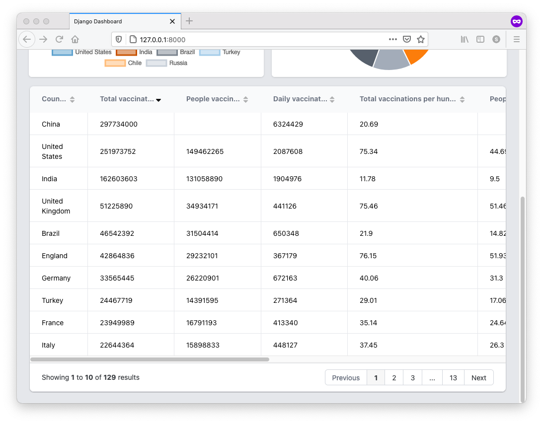
Integrate Grid.js
To add Grid.js to the dashboard app, make to following changes to the home.html.
...

<div class="mt-4 grid gap-4 gris-cols-1 lg:grid-cols-2">
  <div class="lg:col-span-2">
    <div id="dataGrid" class="text-sm" data-url="{% url 'table' %}">div>
  div>
div>

...

<script src="https://unpkg.com/gridjs/dist/gridjs.production.min.js">script>
<link href="https://unpkg.com/gridjs/dist/theme/mermaid.min.css" rel="stylesheet" />
<script src="{% static 'js/grid.js' %}">script>

<script>
  ...
  let dataGrid = document.getElementById("dataGrid")
  renderGrid(dataGrid)
script>
First, add a new div grid container just after the one with the two charts. The inner div contains a the url to the data endpoint as data-url attribute. As the grid will display quite a few columns, we want it to span the whole width of the screen, i.e. two columns on large screens. Next, copy the script tag and the stylesheet link from the Grid.js installation guide and paste it into the template. Lastly, add two lines of JavaScript at the bottom, where you specify a reference to the wrapper element and then pass it to a function renderGrid().
To implement the JavaScript function, create a new file grid.js in the static/js directory.
// static/js/grid.js
const COLUMNS = [
  {
    name: "Country",
    id: "country",
  },
  {
    name: "Total vaccinations",
    id: "total_vaccinations",
  },
  {
    name: "People vaccinated",
    id: "people_vaccinated",
  },
  {
    name: "Daily vaccinations",
    id: "daily_vaccinations",
  },
  {
    name: "Total vaccinations per hundred",
    id: "total_vaccinations_per_hundred",
  },
  {
    name: "People vaccinated per hundred",
    id: "people_vaccinated_per_hundred",
  },
  {
    name: "People fully vaccinated per hundred",
    id: "people_fully_vaccinated_per_hundred",
  },
  {
    name: "Daily vaccinations per million",
    id: "daily_vaccinations_per_million",
  },
];

function renderGrid(wrapper) {
  let url = wrapper.dataset.url;
  new gridjs.Grid({
    columns: COLUMNS,
    pagination: true,
    sort: true,
    // search: true,
    // fixedHeader: true,
    // height: '400px',
    server: {
      url: url,
      then: (data) => {
        return data.data
      },
    },
  }).render(wrapper);
}
First, we define the the column names and ids (corresponding to the keys in the JSON). The function renderGrid() takes a reference to the html wrapper and then uses the Grid.js API to fetch the data from the url. (Check out the Grid.js documentation for examples on how to use the API.)
Refresh the browser to see the result.
Note: Experiment with the search option of Grid.js to enable client-side search. You can also try out the height and fixedHeader option.
Conclusion
The dashboard app is feature completed. You've added a piechart as well as a powerful data grid to your Django dashboard.
Congrats for making it through this tutorial! I hope you found it useful. Any comments and feedback let me know in the comments below.